Everything makes a comeback eventually. From music, fashion, television content, and even, on rare occasions, the mullet. Yes, even the mullet. So it’s not surprising that many of the up-and-coming animation and motion graphic trends we see today are reminiscent of the past, keeping many designs nostalgic and familiar. That being said, the influence of social media, new emergent animation, and motion graphics design software have pushed boundaries.
So, what animation and motion graphics trends are we seeing currently? Read on.
1. Working with 2D and 3D
You may not be aware, but 2D overlays, frames, 3D objects, and vice versa can make for compelling storytelling. The new era of storytelling may just be 2D and 3D elements coming together. Popularized since 2019, it’s become easier to create animations combining these two elements. With technologies like Blender, where open-source 2D/3D is made more accessible, seamless integration is made easier, allowing this new hybrid motion design trend to continue to grow.
2. Animated Logos
We expect messages to be communicated quickly, thanks to bite-sized social media trends. This is an underlying culture shift. Couple this shift with faster and easier internet accessibility and booming online business scenes, and there is no surprise businesses are compelled to add further depth to something that used to be so simple: logos. But here we are. Quick yet effective animated logos have successfully delivered an intended branded message in seconds. Should your logo be animated?
3. 3D still dominate
There is no reason why 3D will not continue to dominate as a popular animation trend in 2022 and beyond. If anything, we may see motion graphic artists push the use of 3D elements in all industries and all types of content. We may have more hybrid content similar to the 2D/3D combo. With 3D elements, designers create realistic motion graphics and animations that other forms of design trends have yet to be able to showcase. So, no doubt about it, you can anticipate 3D to be the formative base for many design trends in 2022 and onward.
4. Grain
Grain, as the name implies, adds a grainy texture to vector imagery. You might think this ruins the original illustrations, but adding grain brings authenticity to the animation. A little grain makes for an almost homey feel, which many viewers find welcoming. It is also an easy way to add extra depth to what would perhaps be viewed as a more plain design.
5. The Retro Nostalgia
As mentioned earlier, everything seems to come back at some point. Regarding design, retro styles and feel are quickly returning into the world of creativity. Gradients, lens flares, and shadows are what designers are implementing into storytelling, but only when appropriate. These elements give animations a nostalgic touch, remembering the simpler times. Pretty sure we can all appreciate simplicity these days. Embedded in popularized cultures, a set of colors and typefaces can all work as reminders of a certain era, making these approaches ideal for designers aiming to create a certain vibe, triggering specific emotions.
6. Limited and Uniform Color Palette
Non-fussy, hassle-free, but equally impactful. This one is for the long haul, for the committed ones. This animation style is popular for companies keen on setting a clear branding impact. The restricted color palette helps retain viewers and creates uniformity throughout the animation. The visual appeal of using a rich palette with semitones and primary colors doesn’t go unnoticed. Here is to say more with less!
7. Lines
Non-fussy, hassle-free, but equally impactful. This one is for the long haul, for the committed ones. This animation style is popular for companies keen on setting a clear branding impact. The restricted color palette helps retain viewers and creates uniformity throughout the animation. The visual appeal of using a rich palette with semitones and primary colors doesn’t go unnoticed. Here is to say more with less!
8. Loops
As social media grows, the appreciation for a satisfying animated loop also grows. And this love for a good loop also seems to have extended to the world of motion graphics. This new year, a loop of animation to convey a message is all the rage. Loops are found in both long and short-format motion graphic videos, and as always, using different design elements opens space for different feels, messaging, and storytelling components to be effectively conveyed.
Be it trippy…
9. Morphing
An effect in motion graphics that changes one image or object quickly into another with a seamless transition is called, you guessed it, morphing. Design flows well together and gives continuity to the motions as morphing occurs. This design effect has come back since the 2000s when morphing was used for bold branding. It was mostly popularized by entertainment agencies like VH1, with their iconic logo morphing over the years.
However, we are seeing this effect has seen some refinement, going beyond the loud and bold transition styles of the 2000s to more subtle forms of morphing that can be used for corporate slides and more professional tones needing a touch of memorable creativity.
10. Data Visualization
DATA DATA DATA! It’s everywhere, it’s complicated, and it’s so important!
The numbers don’t lie, and nowadays numbers seem to really stick with viewers if strategically communicated….like in animated shorts!
Have you ever seen spreadsheet formulas on billboards, bus ads, or train ads? Yeah – us either. The point is, it’s important to make data compelling and easy to digest. You have to put some lipstick on that pig, cuz that pig can bring in the bacon.
11. Hyper-Realistic CGI
Hyper-realistic CGI has been in high demand, with expectedly good eye-catching results. Thanks to advancements in computer-generated animation, we can now bring live-action scenes to life with ultra-realistic motion graphics. With cutting-edge design techniques, we can replicate real-world elements with jaw-dropping accuracy, resulting in mesmerizing experiences in product design and promotional videos.
By closely mimicking real-life objects and interactions, we unlock new points of connection for designers and animators. It’s simple, detail is compelling and persuasive. Now, viewers can truly visualize products/services vividly.
12. Multi-Dimensional Motion Graphics
Animation can now come alive inside your video, making for an extremely cool animation trend. This trend is seen in many of Apple’s recent ads, which often use a combination of live-action footage and animated graphics.
A single animated scene that combines 2D objects, photos, illustrations, and even real-life products. By mixing 2D elements in 3D or live-action settings, designers are able to create a captivating contrast between the ordinary and the extraordinary. Imagine familiar objects set against unconventional backdrops.
13. Stop-Motion and Claymation
The animation industry has circled back to its roots! The classic choppy feel of Stop-Motion could open the door for inexpensive and effective marketing.
Claymation, the clever cousin of stop-motion animation, brings the magic of 3D software to life. Say goodbye to tedious and expensive production times, because Claymation offers a faster and budget-friendly alternative. It’s no wonder this captivating technique has caught the attention of commercial producers and creative projects alike!
14. Immersive 3D Experiences
Sure, we all know that 3D seems to be here to stay, but there is more to be done with this innovative graphics style. It’s time to embrace immersive 3D experiences, creating visually stunning graphics that go beyond traditional flat designs. This trend involves using three-dimensional elements to add depth, realism, and engagement to animations, providing audiences with a more interactive and captivating viewing experience and enhancing user engagement through micro-interactions.
There are even opportunities for using subtle animations and feedback mechanisms to respond to user actions, providing a more interactive and user-friendly experience. Micro-interactions provide a seamless and enjoyable user interface, from button animations to loading sequences. It will really feel like you are present, and suddenly, as a viewer, you become more invested in the provided experience.
Prioritizing digital creativity remains crucial, and Adobe users’ acquisition of Figma underscores their commitment to facilitating the seamless integration of designs for creatives.
15. Abstract and Organic Shapes
This trend involves using irregular, fluid, and asymmetrical shapes, adding a dynamic and visually appealing element to animations. It allows for more creative freedom and a departure from traditional geometric forms. These days, designers increasingly incorporate abstract and organic shapes into motion graphics to break away from rigid structures. Something is intriguing about seeing a culmination of shapes distributed in an abstract way.
What was once old is new again. It seems likely that this year will provide a mix of the old with the new. Take heed as you notice recognizable typefaces, colors, and integrative motion graphics and animations continue to surface. While new design elements take these nostalgic styles to another level, we can still be sure that design variations will always be based on the creative mind working its magic. Coupled with understanding the purpose of any given design, the results will be next level. Regardless of whether we are meant to be sent into the future or back in time, you can be sure that the motion designers will be taking us on a never-ending journey.
16. Kinetic Typography
Typography is no longer just static text on a screen—it’s alive and moving. When you think of kinetic typography, imagine animated text in a way that enhances storytelling, whether through bold entrances, fluid transitions, or synchronized movements with music and voiceovers.
This trend has surged in popularity in social media ads, explainer videos, and promotional content, adding a more dynamic energy base to messages while keeping viewers engaged.
17. AI-Generated Animation
Yes, we may not be super excited about it, but as we know, artificial intelligence has made its way into most creative scenes. Animation is no different. With AI, automating tedious tasks and unlocking new creative possibilities is simpler.
With tools like Runway ML and DeepMotion, designers can now generate high-quality animations faster and experiment with motion in ways never before possible. From helping characters move naturally to creating seamless motion sequences, AI-powered tools are used more in business and creative projects. Expect to continue to see AI-driven animations shaping the future of motion graphics.
18. Glitchy Visuals & Digital Flicker
For those who have no idea what this is, let us explain. Glitch effects and digital distortion make visuals look like a broken screen—think pixelation, color shifts, or static—giving animations a cool, techy, or futuristic feel.
Surprisingly, glitch effects and digital distortion remain popular stylistic choices for motion designers. Inspired by old-school VHS tapes, pixelation, and compression artifacts, this trend adds an edgy, futuristic feel to animations. It’s typically used in tech-driven branding and even music videos, giving designs a more raw and digitalized appearance.
19. Liquid Motion
Liquid motion is growing in its popularity. By using fluid and wavy animations that mimic the organic movements of water, ink, or melting wax, the user almost becomes entranced by its mesmerizing effects in motion graphics. Liquid motion brings an element of smoothness and a more natural flow to transitions, title sequences, and background elements, making beautiful, vibrant colors and abstract designs come together perfectly.
20. Isometric Animation
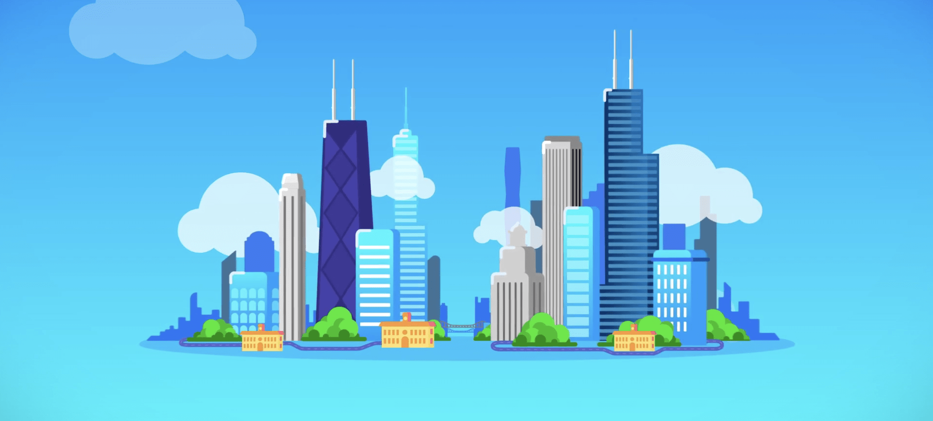
Isometric animation presents 3D-like visuals in a simplified, geometric format, offering a clean and modern look. Nowadays, this form of animation is frequently used in explainer videos, UI/UX design, and infographics.
It’s a great way to communicate complex ideas while still engaging your audience. The illusion of depth in isometric motion graphics allows designers to craft what we think of as intricate, visually rich scenes without overcomplicating the experience for a viewer.
Motion graphics and animation are here to stay and are one of the best ways to tell a complex story in a meaningful way. Bottle Rocket Media specializes in motion graphics services and video production services. Connect with our team to create a brand story that is entirely your own and makes an impact.


