Motion graphics are more than just exciting visuals.
They can educate your audience, entertain your viewers, and drive action.
But here’s the thing: if you’re not thoughtful with the details, you risk wasting your message.
If you’re an agency leader, creative director, or a part of an internal marketing team, listen up. These mistakes to avoid in motion graphics design will help you steer clear of visual chaos and deliver clarity with style.
Let’s break down the most common issues we see and how to fix them.
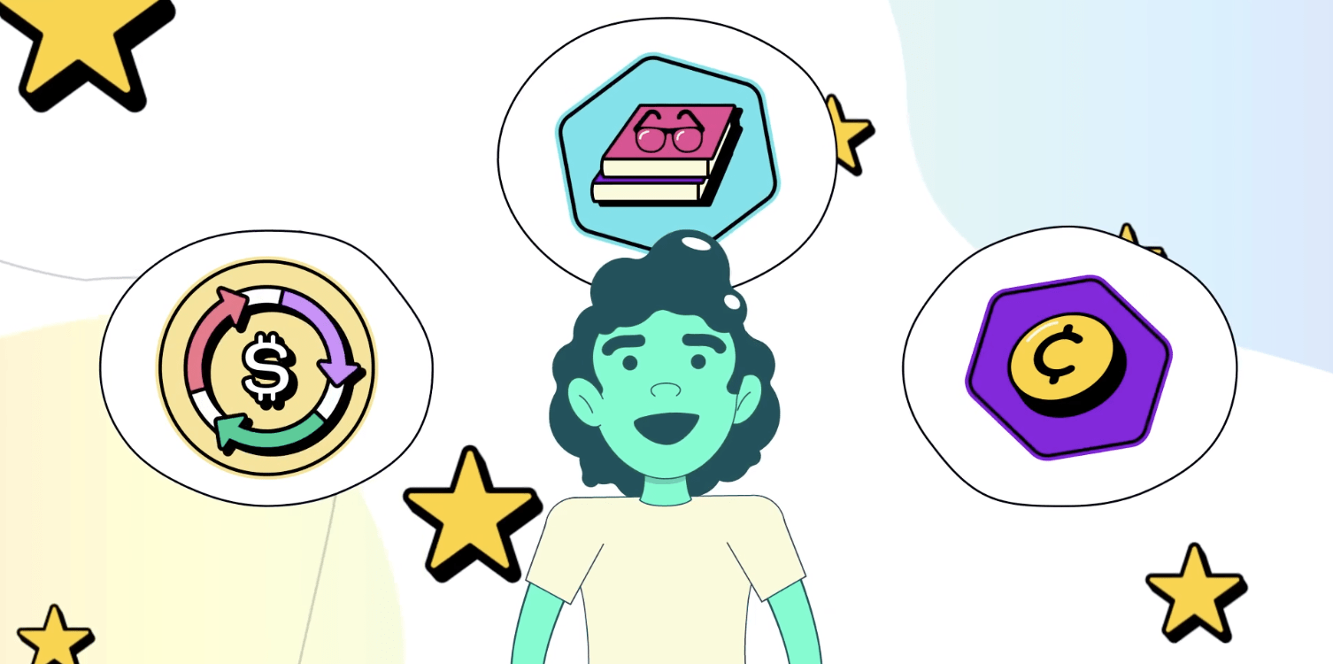
1. Skipping the Strategy Phase
One of the most overlooked mistakes to avoid in motion graphics design is diving into animation before defining the purpose. Motion graphics are compelling storytelling tools, so if you’re not starting with strategy, you’re setting your audience up for confusion down the line.
Start with:
- A clear objective: What are you trying to communicate?
- Audience understanding: Who are you speaking to?
- Platform expectations: Where will it live? What are the specs?
- Brand alignment: Does the style reflect your identity?
At Bottle Rocket Media (BRM), every animation project begins with a strategy document. We map the narrative arc, visual style, and emotional tone before we even think about opening After Effects.
Taking time to plan from the beginning leads to motion graphics that feel purposeful, effective, and well-executed.
Start with strategy first, and you’ll see a noticeable difference in the quality and clarity of your final result.
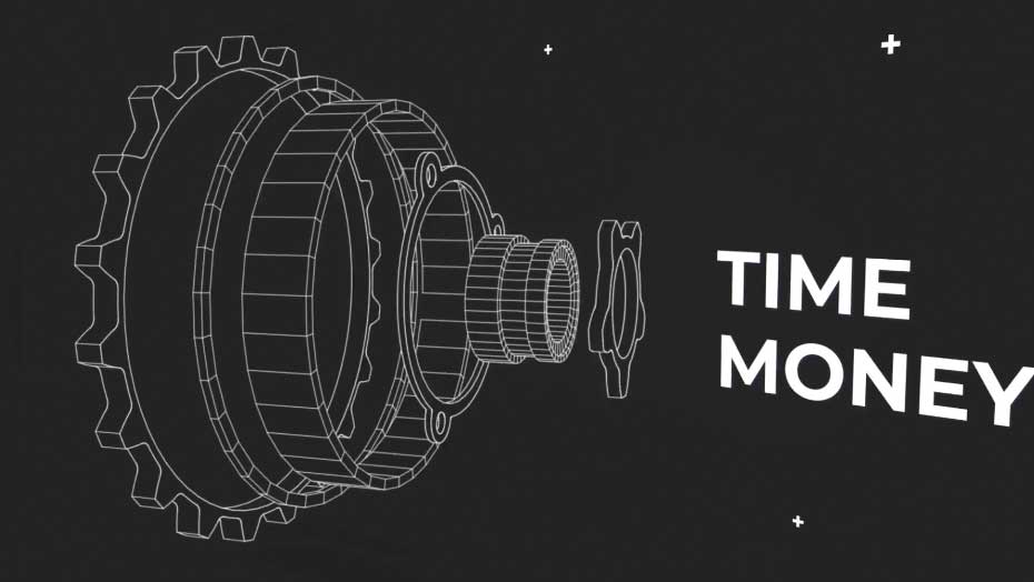
2. Overloading with Effects
Yes, tools like Trapcode and Element 3D are tempting, but one of the most frequent mistakes to avoid in motion graphics design is going overboard with the bells and whistles. Visual overload weakens the message. More isn’t better; it’s just messy.
Common signs you’re overdoing it:
- Multiple transitions layered back-to-back
- Unnecessary light flares or particle explosions
- Constant text bounce-ins and zooms
The fix? Intention over excess. Use animation principles like anticipation, ease-in and ease-out, and follow-through to guide the movement. Let your design breathe, and trust that the storyline is grabbing the viewer’s attention while your graphics complement the story.
3. Ignoring Timing and Pacing
Motion is rhythm, and poor pacing is like an offbeat song; it just feels wrong. This is one of the sneakier mistakes because it doesn’t show up in stills or style frames. You catch it in the flow.
What poor pacing looks like:
- Titles flying in too fast to read – If viewers don’t have time to process the text, your message is lost. Fast-moving titles may look cool, but if they flash by too quickly, they become visual noise instead of helpful content.
- Pauses that feel awkward or too long – Lingering too long on a frame can disrupt the viewer’s engagement. It’s tempting to stretch out a moment for dramatic effect, but overextending kills the momentum and risks losing attention.
- Transitions stepping on the dialogue or VO – When transitions aren’t timed to support voiceover or dialogue, they can distract or drown out what’s being said. The result is a disjointed viewer experience.
- Too much copy on screen – The more text you put up, the more time you need to give viewers to read it. Reading speeds vary, so it’s almost impossible to get the timing just right for everyone. The best approach? Keep the copy short, sharp, and on message.
We recommend playing your animation back at different speeds. Then, you can adjust the timing to match a natural human response. If it feels rushed or laggy, refine it until it flows smoothly. Editing should feel like a conversation, not a monologue.
4. Clashing Design Styles
Mixing 3D renders with hand-drawn illustrations or vintage textures with sleek, modern fonts may sound edgy, but really, it’s just confusing. One of the easiest mistakes to avoid in motion graphics design is forgetting to unify the visual language.
Ask yourself:
- Do all the elements feel like they belong in the same world?
- Is there a consistent use of color, texture, and shape?
- Are we following the same rules of space and depth throughout?
Every design decision should reinforce the brand narrative. A minimalist financial firm doesn’t need neon gradients. A children’s brand shouldn’t use rigid geometric transitions. Know your tone and audience and stick with it.
5. Forgetting About Sound
Sound design is the unsung hero of motion. A bad sound design can make everything feel flat. One of the most critical mistakes to avoid is treating sound as an afterthought instead of a creative driver.
Excellent sound design includes:
- Layered effects (e.g., a pop, whoosh, and reverb for a logo reveal)
- Underscore or ambient track that matches the emotion
- Precise sync with on-screen action (think Pixar-quality timing)
Our audio engineers and editors work closely with animators from the start. We treat sound as a core part of the storyboard rather than a post-production patch. That’s where good design becomes great storytelling.
6. Designing for the Wrong Platform
Designing a beautiful 16:9 animation only to discover it’s meant for Instagram Stories is not ideal. Another common mistake to avoid in motion graphics design is forgetting about aspect ratios, autoplay rules, and audience behavior on different platforms.
Here’s what to consider. Is your content:
- Social-first? Optimize for vertical video and no sound autoplay.
- A Web explainer? Keep intros short and CTA timing clear.
- A Trade show loop? Make it bold, brand-heavy, and able to loop seamlessly.
It’s important to build modular. Design flexible components that can adapt across platforms. This makes it easy to repurpose your animation without having to recreate everything from scratch.
7. Neglecting Brand Guidelines
Motion graphics represent your brand in motion, but one of the most damaging mistakes to avoid in motion graphics design is straying from brand guidelines, especially when you think “nobody will notice.”
They will.
Misuse includes:
- Fonts that “sorta” match the brand
- Colors that fall just outside the palette
- Tone or humor that feels off-brand or risky
At BRM, we collaborate closely with your marketing and brand teams, using your style guide to ensure every frame aligns. Consistency builds trust, and deviation can often lead to confusion.
Make Motion That Matters
Let’s be real: mistakes happen, but when you know the mistakes to avoid in motion graphics design, you can create work that connects, converts, and elevates. At Bottle Rocket Media, we live and breathe this stuff. From IPO pitch deck animations to product explainers to brand story films, we bring clarity and creativity to every project.Do you have a project in mind or want us to help you brainstorm your next big video? Let’s connect. We’ll help you make motion that moves people with our motion graphics services expertise.